.jpg)

.png)
While this isn’t a “guide” or “navigation” app, it has features that facilitate these interactions: a browse section, search button, filters, profile section.
.png)
The map with dots on relevant locations inspired my “Across the Caribbean” section of the home page, where I designed a map of the Caribbean and placed dots on islands with songs represented on the site.
.png)
I was originally going to do a conventional vertical timeline, but this interactive timeline inspired me to be much more creative and adventurous with horizontal white space.
People from the Caribbean diaspora, soca lovers, and those looking to explore more soca songs throughout history.
The strategy for the content shown takes into consideration popularity on Spotify and Youtube, along with island diversity. Although Trinidad & Tobago is the pioneer of soca and tends to dominate the genre, there are also many successful soca songs from smaller islands that deserve the spotlight.
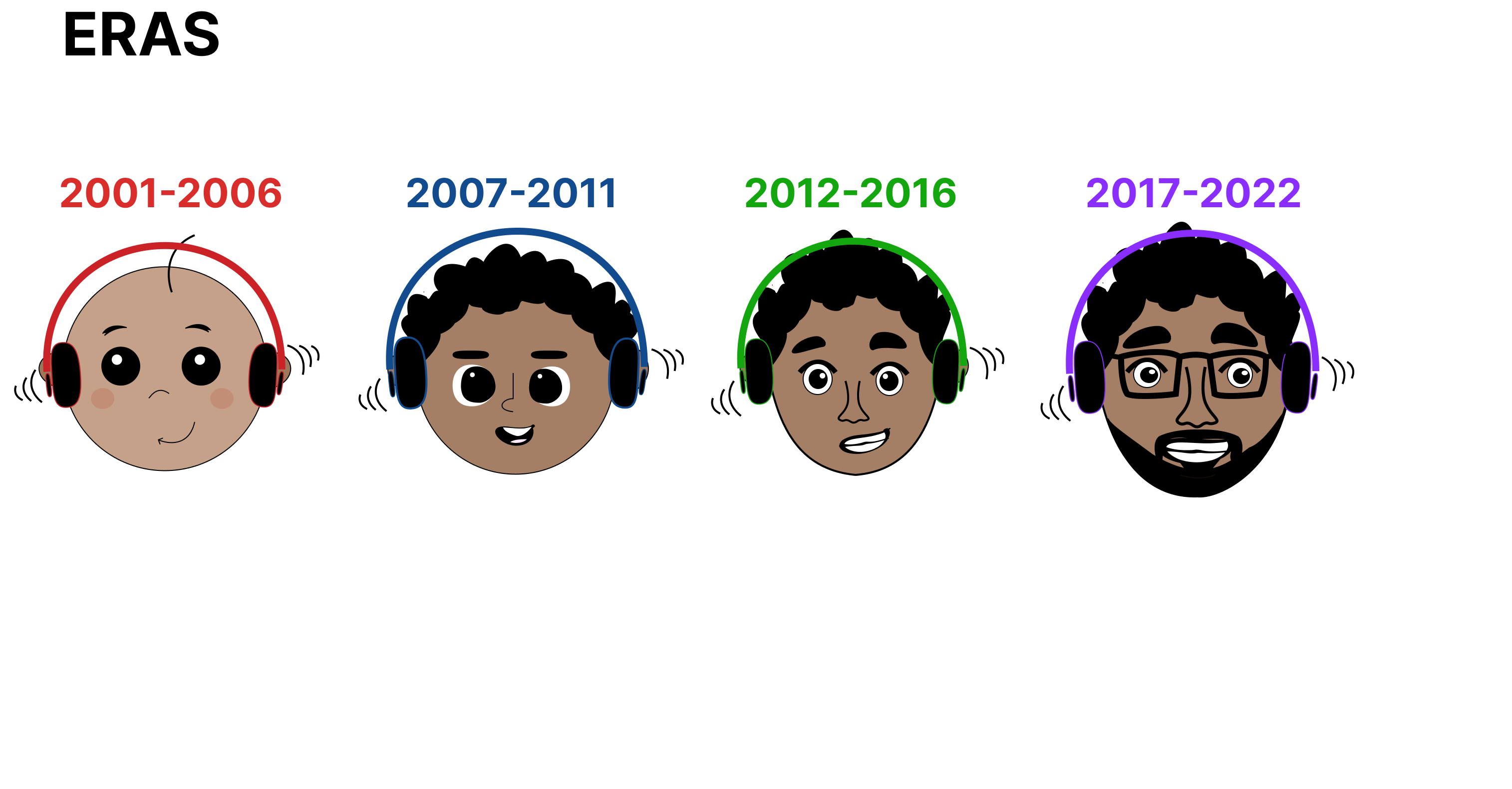
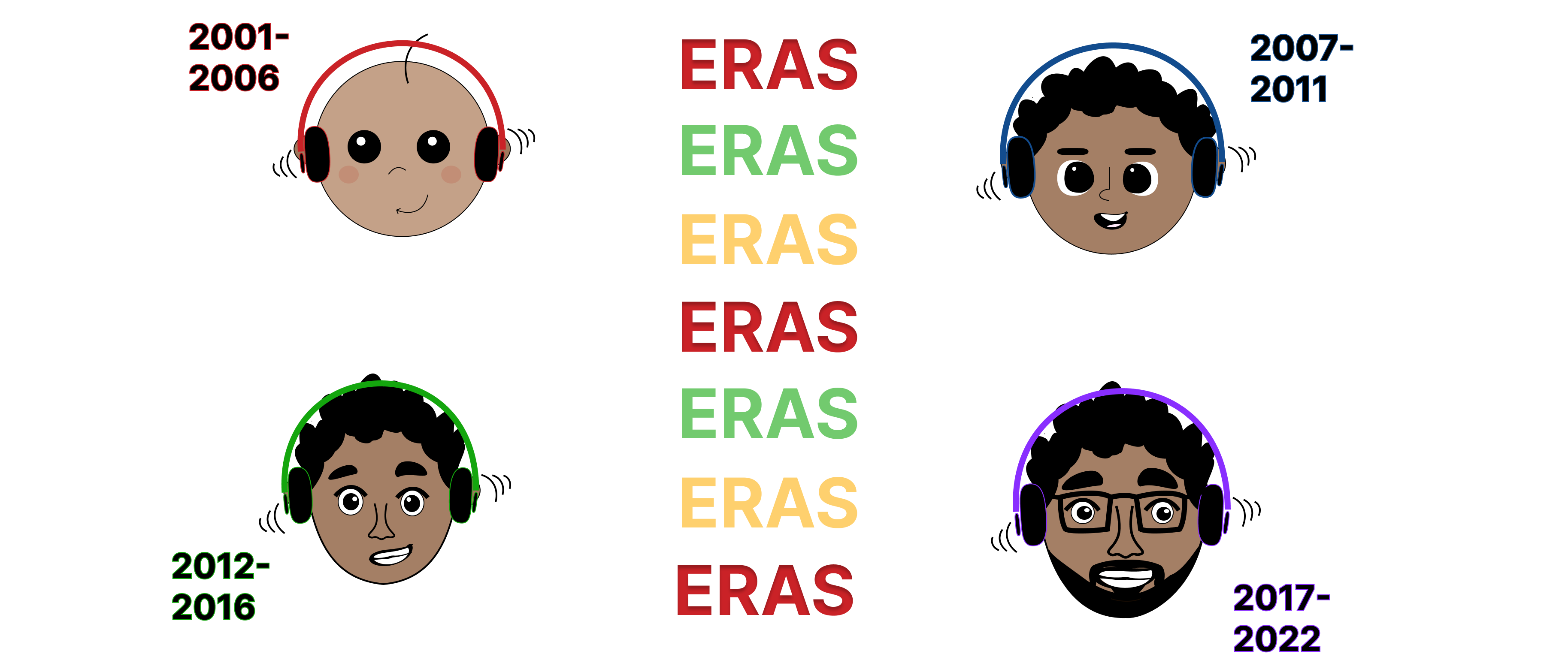
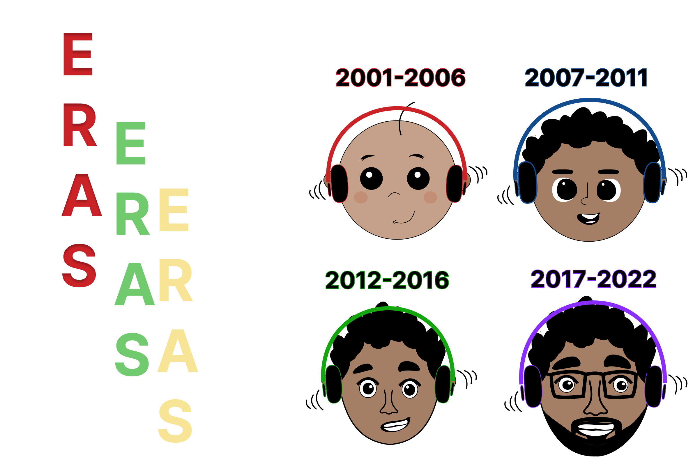
I consider this in the content I select for each group, ensuring representation for multiple islands. The content will be organized chronologically into 4 interior pages from 2001 to 2022.
For the interior pages sorted in chronological order, I researched some of the top Soca songs of each year from 2001-2022, according to chart performances and listener engagement. For each chosen song, I recorded the release year, artist, country of origin, and awards if eligible. Each song also had a hyperlink to Spotify and Youtube, along with their number of plays to promote viewer comprehension of the magnitude of success.
.png)
.png)
.png)
.png)
For the home page, I drafted an educational text that described soca, its evolution throughout the years, and the main islands that keep the musical genre flourishing. The bottom will include a map of the Caribbean with pinpoints on islands represented through the archive.
.png)
.png)
At this stage of my wireframing process, I envisioned a vertical scroll home page and static interior pages. In these interior pages, I designed back and next interactions to navigate between songs, each displayed one at a time.
Objectives
Assumptions and Hypotheses
Methods
Documenting the Testing Process
🗃️ Organization:
To promote intuitive user flow, I can incorporate one horizontal scrolling interaction within each individual page, thus moving all of the songs into one screen and uncovering and covering each song as you scroll. This would promote UX as it reduces the number of actions required to explore the site, subsequently reducing interaction time as well.
👆🏾 Interaction:
Another takeaway is the importance of hovering functions. On my home page, integrating hover actions would help the user process all the information in bits and pieces rather than presented at once. These hover interactions should ideally be a color or size change that displays the information
Used the iterative design process to explore different treatments to image and text, playing with shape, color, size, typeface, saturation, etc.
.png)
Opening Flow
Landing Iteration 1
Landing Iteration 2
Landing Iteration 3
Landing Iteration 4
.png)
Iteration 1
.png)
Iteration 2
%20(1).png)
.png)
.png)
.png)
🧭
Navigation:
I originally structured the interior pages with back and next buttons to navigate between songs within a page. After usability testing, I realized clicking to transport between songs is not only extra effort by the user but more time-consuming than a horizontal scroll function. This revelation allowed me to create a final site with more intuitive and efficient navigation.
🔀
Interactions:
The first time I thought I finished my site, I tried navigating to otherpages from an interior page, and I realized there were only click functions. I worked over those next few hours to design proper hover appearances, experimenting with changes in color, font size, and angle. As you hovered over an image, the image increased in size and its caption appeared. This was an efficient change because the design felt less cluttered, as all text was no longer displayed at once. Creating these hover elements allowed the final form of the site to feel more interactive and digestible.
💡
Innovation:
One of the features I’m most proud of is the musical staff horizontal scroll as a refreshed way to browse through a musical archive. Some feedback I received mentioned that they had never seen navigation alike in a digital platform before!
⏩
If I were to continue work on this project, I would add a sub-navigation bar on the home page to better organize the scrolled content (History, Expansion, Eras, Across the Caribbean). I might also consider reorganizing the layout of “Expansion”, with photos displayed in a horizontal carousel rather than hover functions.
👇🏾 View the Full Prototype in Figma