🇳🇬 ColorsXStudios Interview Redesign

Website Design
Project Overview
This project is a redesign of the COLORSXSTUDIOS interview interface with Nigerian Artist Joeboy. It explores a refreshed way for the reader to encounter this interview, with a distinct typographic voice for each participant.
My Contributions
I established the concept for the site, sketched layouts/grids, conducted typographic research, and brought these ideas to life through mock up screens and a final hi-fi prototype.
Joeboy Interview Site Redesign
ColorsXStudios
Interview Redesign
UX DESIGNER
Published December 14th, 2022
This website redesign is more of a creative exercise, rather than a research-based design. The main design skills involved were evaluating typographic treatment to establish visual hierarchy and legibility on screen.

I selected a brief excerpt of an interview from an online source and used text to design a refreshed way for a reader to encounter this interview. Using typographic principles (font, size, positioning, scale, and color), I would not only restructure the flow of the interview but also create a distinct typographic voice for the participants.

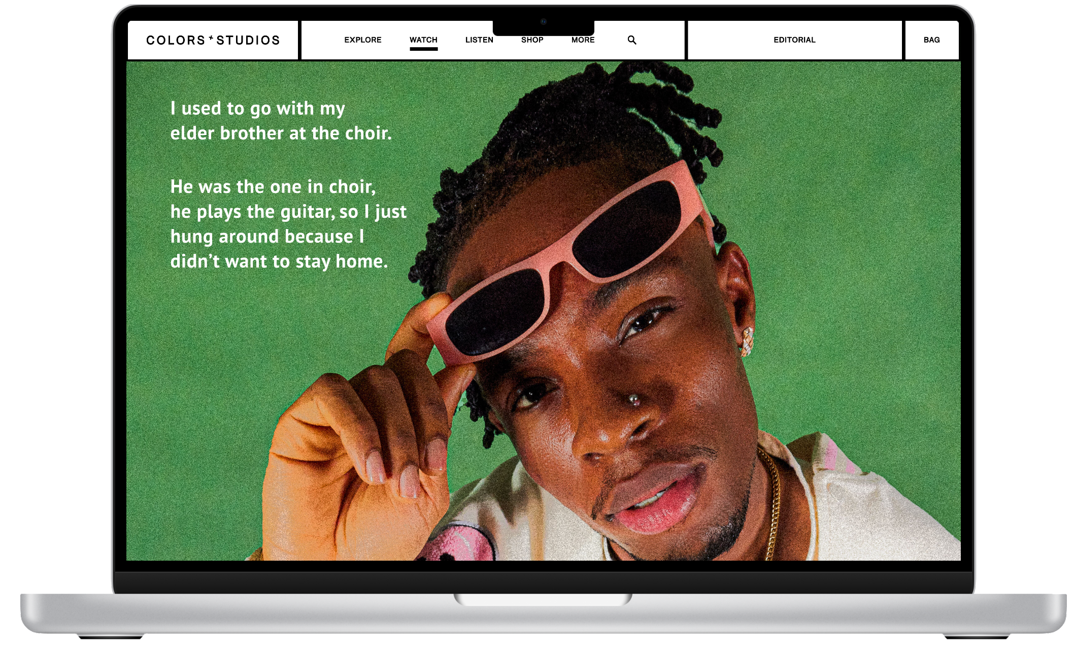
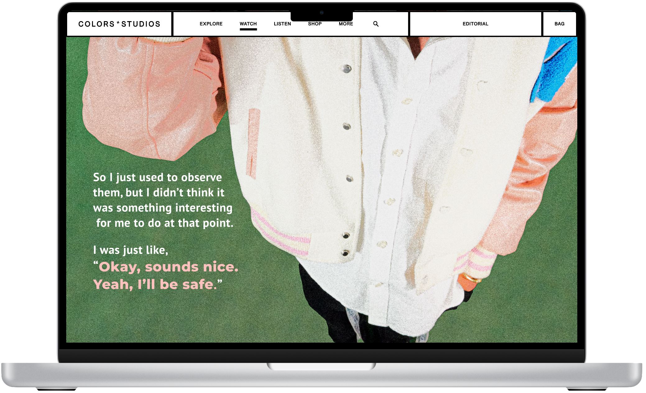
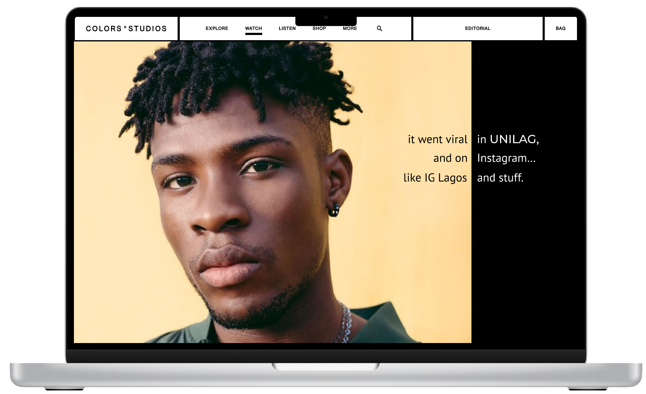
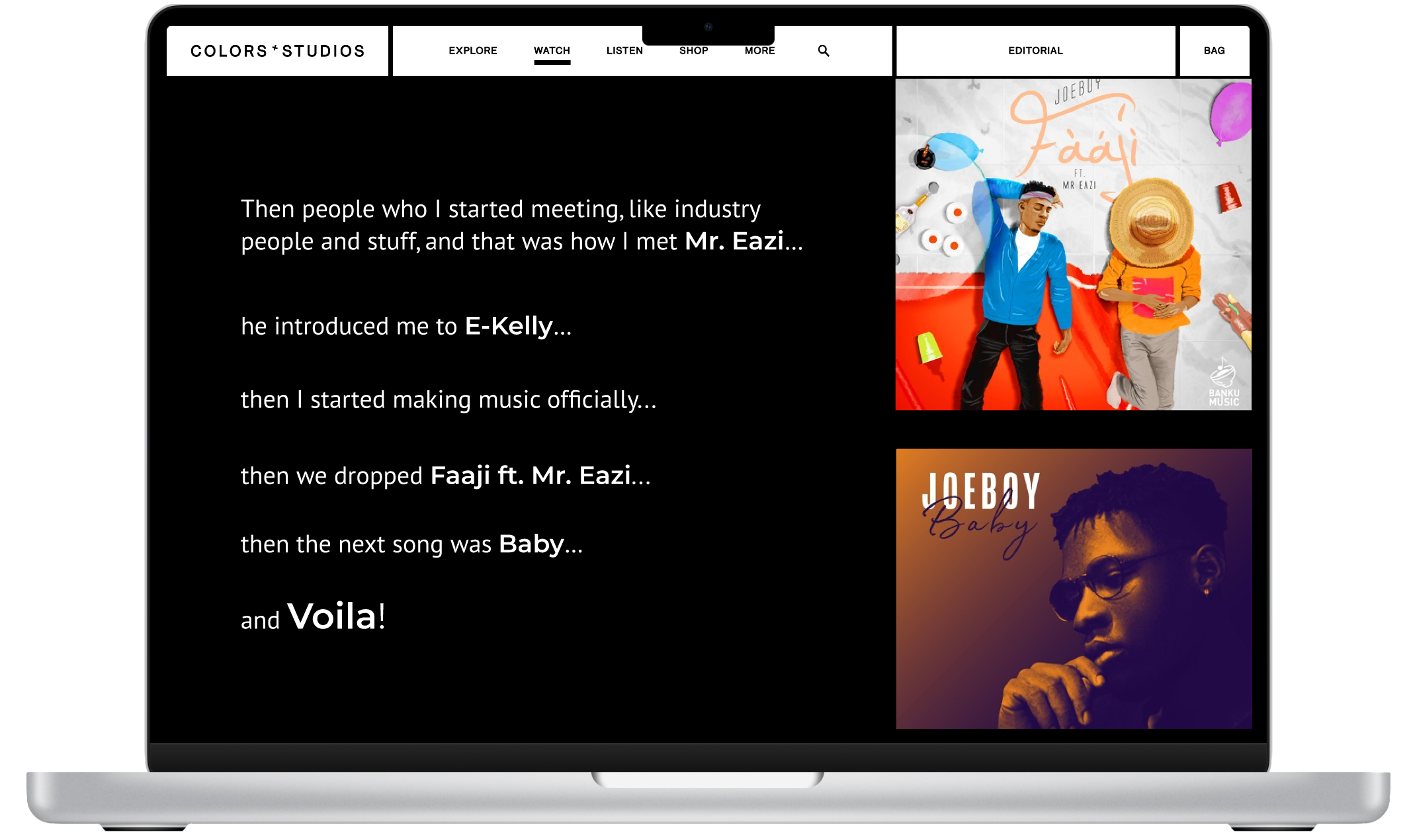
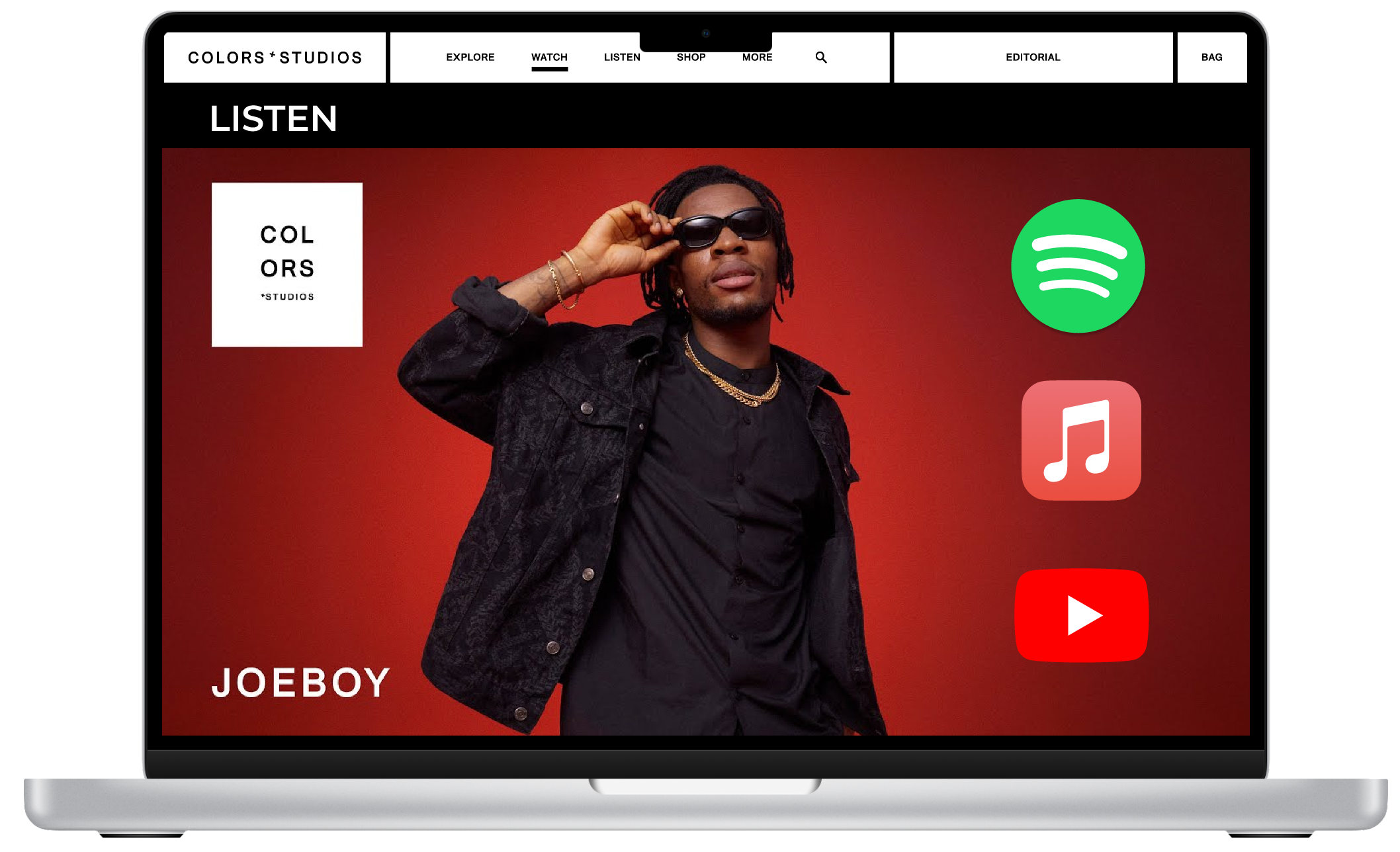
I was excited to implement this project using the musical style of one of my favorite Afrobeats artists, Joeboy. In the original interview, COLORSxSTUDIOS, a German music performance platform showcasing emerging artist talent, interviewed Joeboy about what it means to be an African Popstar.

Keep scrolling to learn more about the evolution of his music and how it relates to his experiences in Lagos, Nigeria.
👇🏾   Watch the Original Interview Below

I. Establishing Concept

Tone

Conversational, artistic, and casual

How might the design and typographic treatment say something about the relationship between the two voices in their design?

This interview doesn’t have the traditional two voices of an interview: interviewer & interviewee; the interviewer is instead presented visually through text, while the only real voice is Joeboy as the interviewee. While this traditional “second voice” was missing in the original video, I implemented the second voice through narration articulations. Anytime Joeboy refers to the dialogue he or someone else says, I make it slightly larger, in a more artistic font (Montserrat), and in a pink color. The goal of this typographic distinction is to bring the dialogue to life and make the interview feel animated and exciting.

Audience

Joeboy fans, Afrobeats fans, Nigerians, those of the Nigerian diaspora, and those looking to learn more about what inspires Afrobeats/Nigerian music.

II. Sketches

Before creating my mockup in Figma, I began sketching in pencil three different ways to approach the layout of the interview carefully considering different ways to use the layout grid.
black and white layout frames for the interior pages

III. Digital Transformation

View some samples below of how I transformed “How Did Your Music Career Start?” into text:
joeboy with green background
body shot with green background
faaji album cover
faaji album page
colors x studios headshot with music streaming icons
👇🏾    View the Full Prototype in Figma

IV. Takeaways

telescope

Experimenting with color, scale, typeface, overlays, and other typological treatments of image/text can add layers of depth to a design that were not originally present.

audience icon

Narrowing down an audience, tone, and purpose is just as critical to the design process, as it sets the foundation for a refreshing design that maintains the original positioning and flow of the piece.