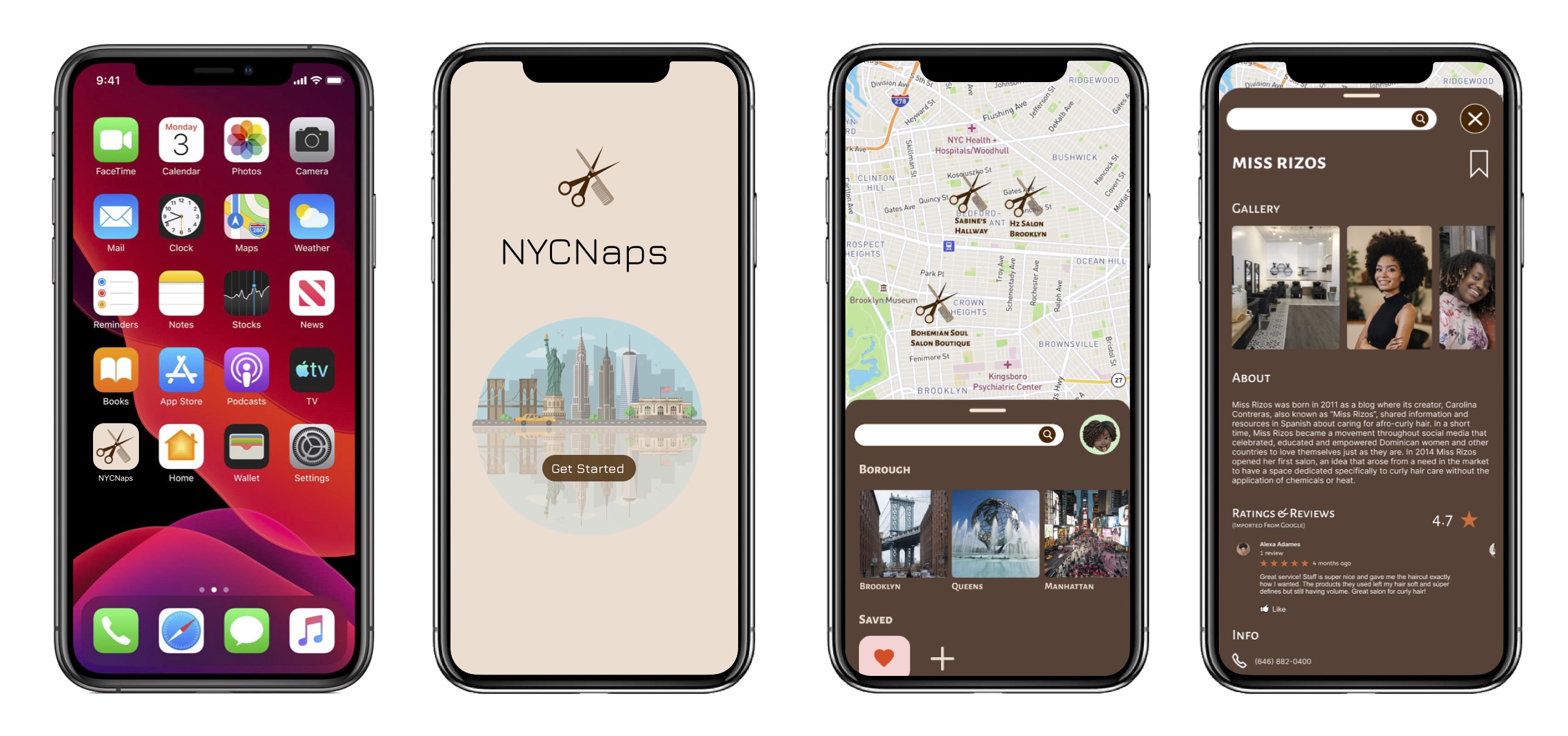

While this isn’t a “guide” or “navigation” app, it has features that facilitate these interactions: a browse section, search button, filters, profile section.
Notable features: current location as home page, filters under search bar, profile, saved sections.
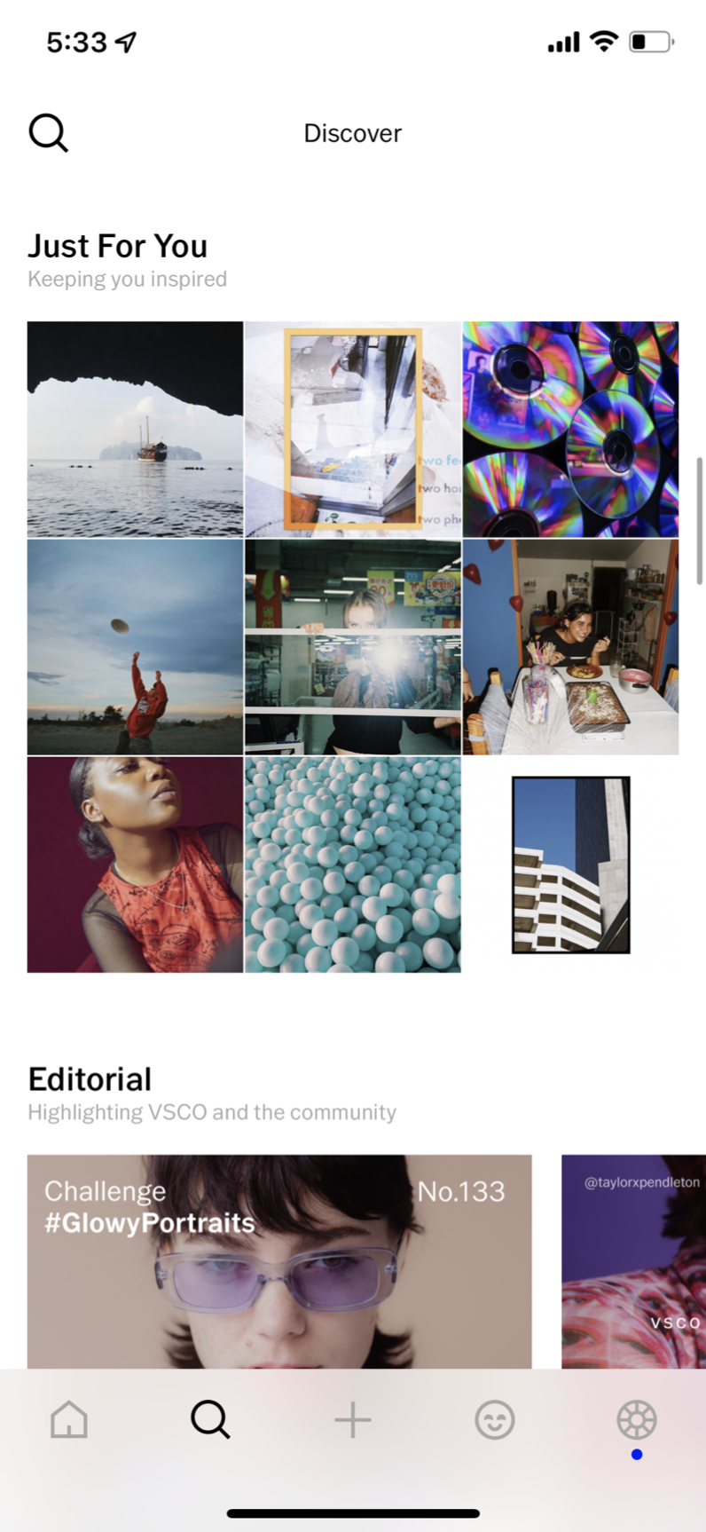
Notable features: layout, pre-set categories, white space, minimalistic
Notable features: centralized landing page, no navigation bar, separate pages as an expansion of centralized landing page to promote website organization
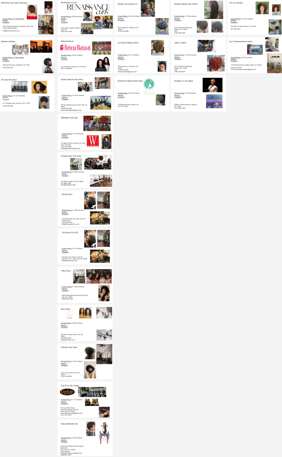
To gain a solid understanding of how many natural hair salons are in New York City, I performed a deep internet search and gathered a database of all-natural hair salons I could find. The majority of salons that the Google Search engine provided were located in Manhattan, with fewer results in Staten Island.
In this search, I excluded any natural hair services that were at-home based or without an official location. Overall, from this process I learned that in a real application of the app, we would need to direct more focus to find salons in Queens, Brooklyn, the Bronx, and Staten Island; the results of the app should not be not centralized in the borough of Manhattan, so as to maintain a wide range of options for users from all boroughs.
.png)
Followed the below steps:
1. Paper Sketches
2. Content Architecture
3. Low-fidelity wireframes with variations
4. Hi-fidelity wireframes
.png)
.png)
.png)
.png)
Used the iterative design process to explore different treatments to image and text, playing with shape, color, size, typeface, saturation, etc.
.png)
.png)
.png)
.png)
⚓
A centralized landing page served as an anchor for all interactions. When the user wants to split into boroughs or individual salons based on the map, once they’re done they would click the “x” interface button and return to the landing page. The same applies to all other interfaces within the app.
🔀
Two pathways (map scroll and borough scroll) to find hair salons allow for the best user experience in the app. The map scroll would allow for a more adventurous search if a user such as Angela wants to find something easily without extra cognitive effort. The borough sort would allow for a narrow, targeted search for users such as Hallie to find a salon within walking distance.
⏩
If I were to continue work on this project, I might rework the appearance and organization of content on individual hair salon pages. I would consider moving the gallery to the top of the page in a carousel format, while the name and other relevant information all get placed below. This might draw the user’s attention more to the gallery and the portfolio of the salon to get a better sense of their style.
👇🏾 View the Full Prototype in Figma