These design decisions establish a unique visual language and encapsulate the personality of the site. This visual language resonates seamlessly with the target audience, ensuring that the functional activity of exploring recipes becomes a visually appealing and enjoyable journey for users passionate about the intersection of technology and culinary arts.
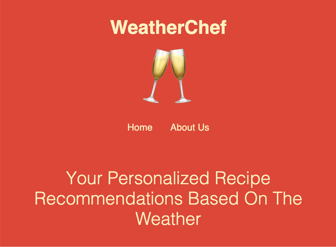
The design is characterized by vibrant colors and a clean, user-friendly layout. The color scheme, featuring warm reds and yellows, creates an appetizing atmosphere that is cognitived associated with food and restaurant websites. The use of weather-related emojis adds a touch of playfulness, making the platform inviting, engaging, and enjoyable.
Breakpoints and styling are implemented across mobile, tablet, laptop, and monitor screens to enhance accessibility and usability, allowing users to enjoy the platform on the go.
The user interface is intuitive, with a straightforward navigation menu and clear call-to-action buttons. It begins with a question and call to action buttons to clearly indiciate where users should go first. Users can easily input their current weather conditions through the click of a button. The loading feature underneath upon website load adds an extra element to display that the functionality of the website occurs when committing an action. The layout is organized, presenting information in a structured manner, making it easy for users to explore recipes.
The weather simulation section dynamically updates based on user input, creating an engaging and interactive experience. Users can visualize the current weather scenario and enjoy a real-time connection between their surroundings and suggested recipes.
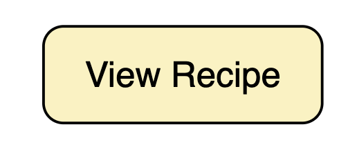
The site incorporates hover effects in size and color on recipe cards; the goal of this was to help guide users as they navigate the site and highlight potential opportunities for interaction. Hovering over recipe cards adds a visual touch, enhancing the overall user engagement. Each recipe card includes essential details, such as the recipe image, title, and a "View Recipe" button that directs users to the full recipe.
👇🏾 Try it Yourself
👇🏾 View the GitHub Repository

Programming a comprehensive site in Javascript for the first time presented a steep learning curve! The task was further complicated by seamlessly integrating the Spoonacular API within the JavaScript framework, requiring distinct functions to target various features of the API. Leveraging instructional resources, particularly YouTube videos, played a crucial role in unraveling these intricacies and enhancing my understanding of web development. I'm looking forward to the next websites I will build in future coursework!