.jpg)
👇🏾 Read about my design process below
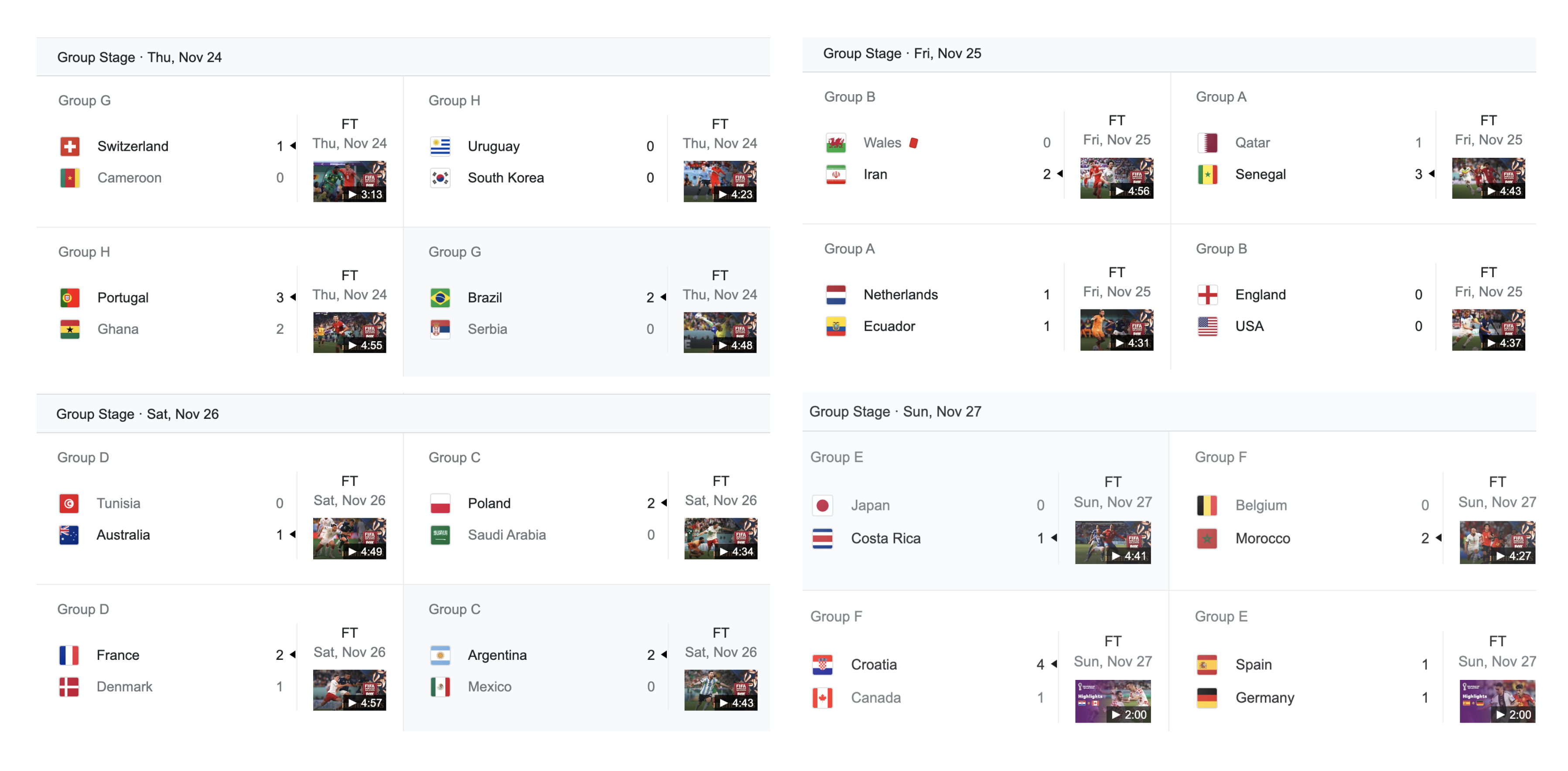
My first step in the data visualization process was turning each match into a sticker-like entity, organized by date in chronological order.
.png)
.png)
My first step in the data visualization process was turning each match into a sticker-like entity, organized by date in chronological order.
.png)
I later developed more interactive elements to the design, such as a flip interaction that displays the number of shots, pass accuracy, and the number of yellow cards.
.png)
Color was used for both consistency and variation in my design. Burgundy and yellow were colors of the Qatar World Cup brand, and should also be applied in the app for consistency.
.png)
Color also provided typographic hierarchy and distinction between interactive elements.
.png)
Features include a tapping interaction over each card, revealing the number of shots, pass accuracy, and the number of yellow cards. There is also easy navigation between Today, Week, and Month Categories through a submenu.
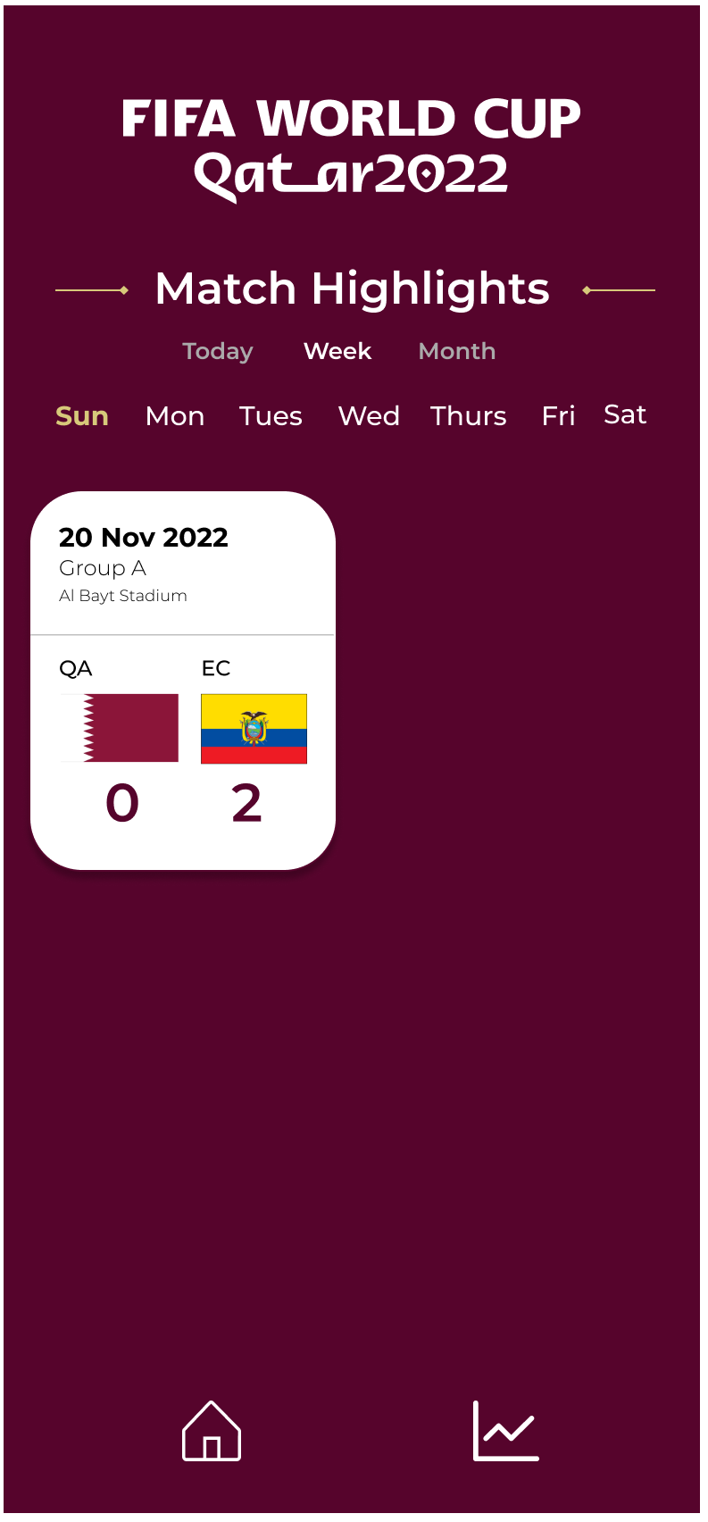
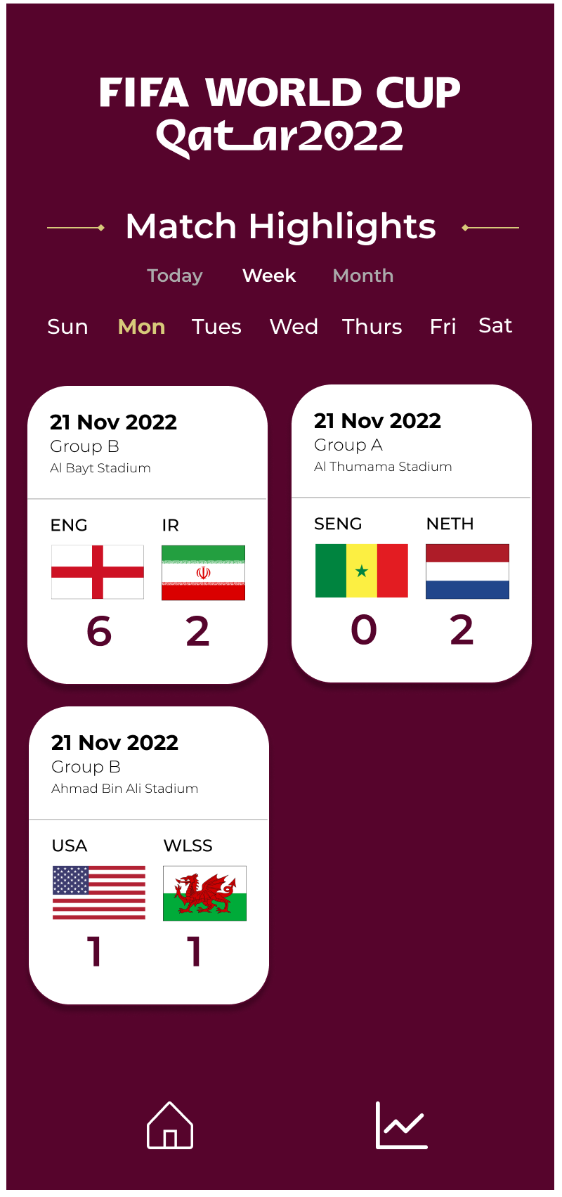
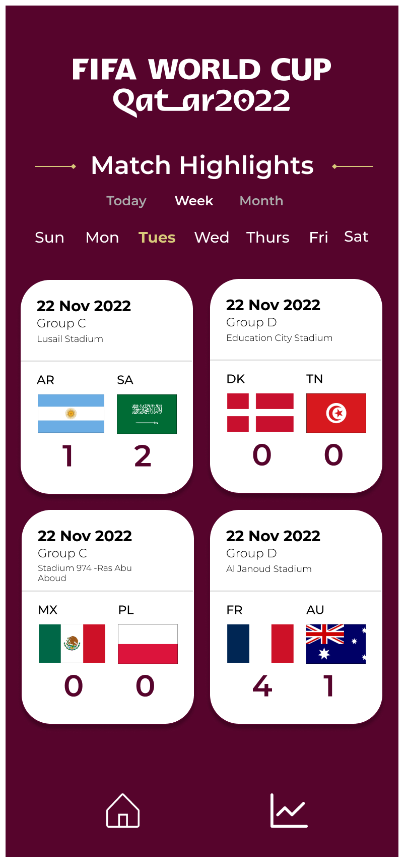
Alongside the card interaction and submenu, there is also easy navigation between all seven days of the week for easy navigation within the category.
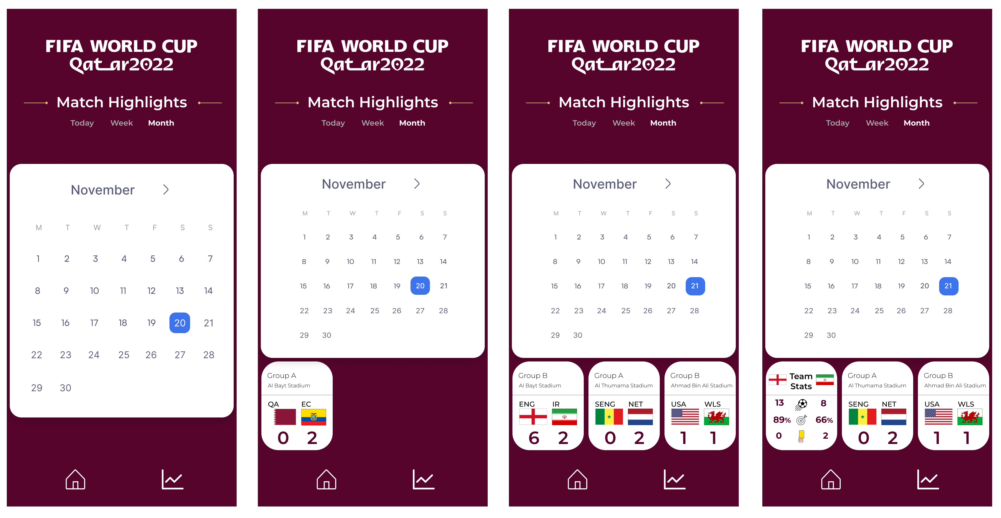
Alongside the card interaction and submenu, there is also easy navigation of all calendar days. There is a bright blue color applied to the current day, and a blue hover property is applied to promote easy distinction and navigation for the user within the calendar.
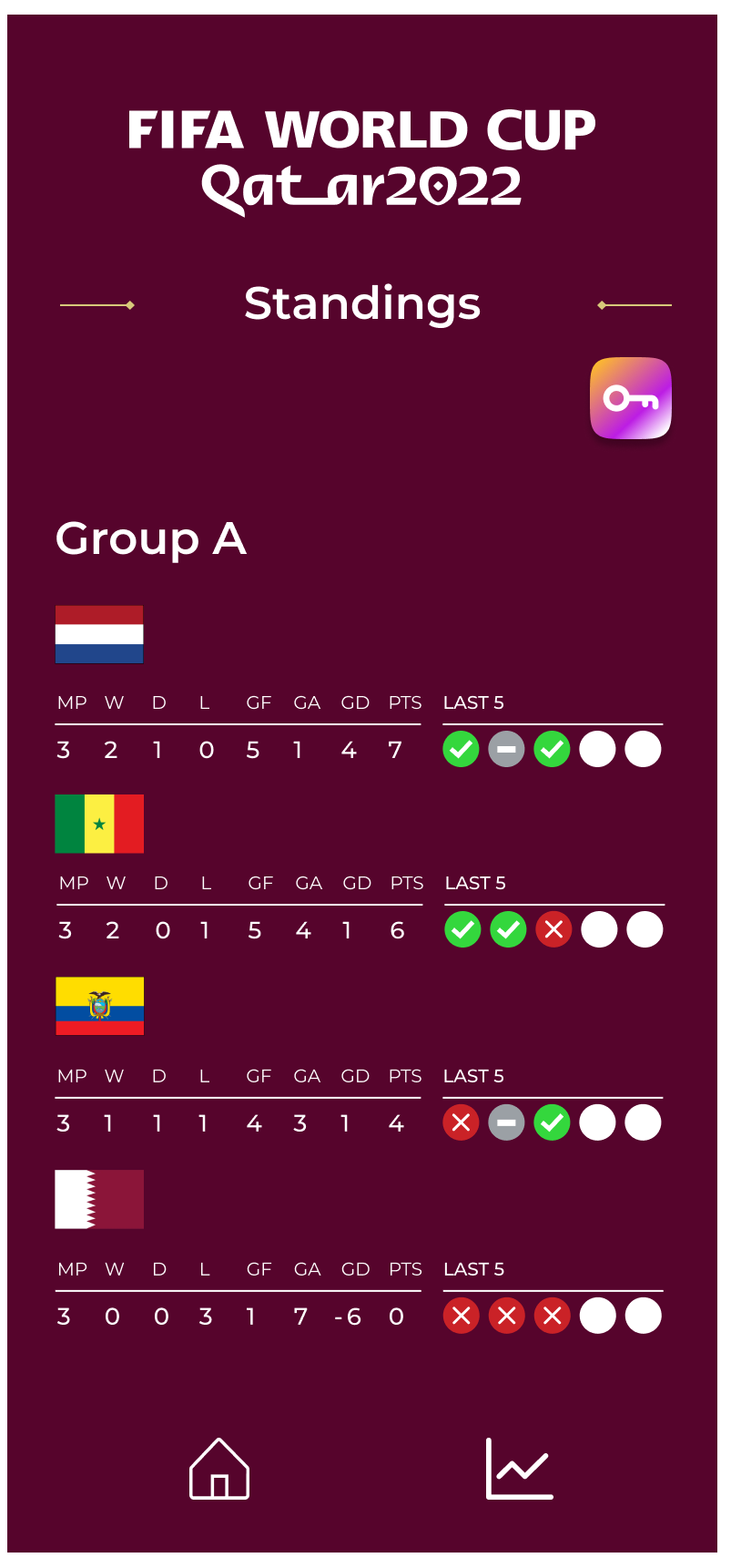
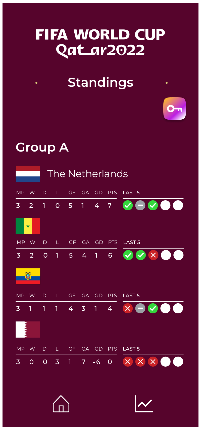
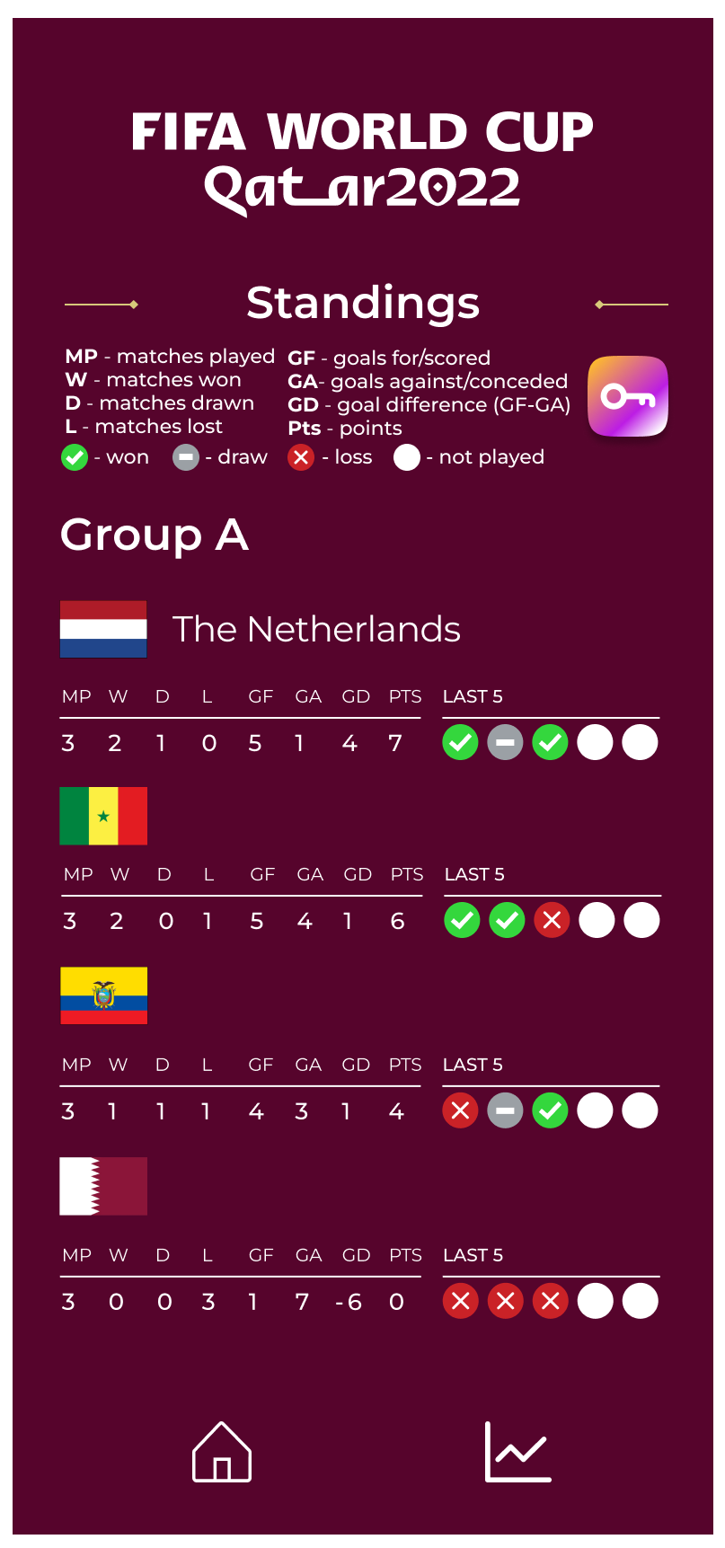
Features include a tapping interaction over each flag that displays the country name and another tapping interaction over the key symbol that reveals the definitions to better understand the symbols used in the infographic.
👇🏾 View the Prototype in Figma
🗄️ Diverse Organization of Data: Daily, Monthly, Weekly.
Representing the data through these 3 categories supports user data comprehension, as they can perceive the statistics through more than one chronological lens. This organization allows more autonomy for the user to choose how much data they want to view at once.
🕹️ Interactive Features such as hover and tapping functions promote user experience by consolidating necessary information into plain view and allowing the user to opt into revealing additional features. Interactions such as the country name or key reveal prevent a cluttered screen which is an important usability principle of designing mobile applications.
🎨 Detail Orientation:
Color, typography, layout, and visualization support data comprehension because they are established through shared visual properties (i.e: menu items, background colors, interactive elements). Linking interactive elements with shared visual properties promotes consistent, legible, and varied design to support ease of user experience.