

Empowering Cybersecurity Learners
Redesigning the cybersecurity learning experience for 800k+ users

Key Insight: Focus on Self-Initiated Learners
Research revealed what these learners need:
Confidence - Show progress and clear next steps
Determination - Motivate and reward effort
Social Connection - Enable collaborative learning
Scope Decision: We deprioritized social features after client alignment, as child safety protections would exceed our capacity and timeline. We focused on confidence and determination features we could implement effectively.

Our validation approach:
Ideas We Explored
We tested everything from social features to AI tutoring to understand what truly resonated with learners.

picoAmbassador - Mentorship program connecting experienced users with beginners

Study Groups - Collaborative spaces for solving challenges together

Certificates - Tangible rewards for completing learning milestones

picoMobile - On-the-go cybersecurity learning app

picoFaceOff - Low-stakes competitions for friendly rivalry

In-platform Rewards - Progress badges and achievement tracking

Learning Paths - Structured guidance through curated challenges ✓

AI Assistant - Intelligent tutoring and strategy reflection ✓
Rapid Prototyping with AI
To accelerate our testing cycles, I leveraged AI prototyping tools (v0.dev) to transform Figma wireframes into functional prototypes. This workflow sped up our design process significantly—instead of spending hours connecting arrows in Figma, we deployed interactive prototypes that users could actually click through and experience.
The benefit? Faster iterations meant more rounds of testing, leading to stronger insights. We could test 30 prototypes in a week because AI tools eliminated the bottleneck of manual prototype building.

What We Learned Through Testing
Rewards need context. Badges alone weren't motivating—what mattered was clear indicators of learning outcomes. Users wanted rewards that reflected meaningful progress, not just participation.
AI should solve impossible problems. Rather than forcing AI into the product, we asked: "What user needs can AI solve that would be impossible to scale manually?" This reframe led to our AI reflection feature that analyzes user strategies—something that would require massive human effort otherwise.
Implementation matters more than concept. The same idea could succeed or fail depending on execution. Personalized features tied to specific user goals consistently outperformed generic one-size-fits-all solutions.
Social features need safeguarding. Through participatory design workshops with our client (using "Tarot Cards of Tech"), we uncovered that social features would require extensive child safety protections beyond our timeline. We strategically deprioritized these to focus on what we could deliver effectively.
Strategic Prioritization
Using frameworks like Impact vs. Effort Matrix and MoSCoW prioritization, we collaborated with our client to narrow 120 ideas down to solutions that delivered maximum value within our constraints. We focused on features addressing confidence and determination—the two pillars we could implement effectively while maintaining platform safety.

Impact vs. Effort Matrix

MoSCoW


Layer 1: Guidance – Learning Paths


Layer 2: Momentum – Gamified Progress
The Challenge: How could we scale this to accommodate our new features while making it a delightful and useful experience?
Designing the Profile Experience
The redesigned profile serves as a personal dashboard that celebrates growth and maintains momentum through five key components:


Solve Count Badges (5, 10, 25, 50, 100+ solves)
For dedicated learners hitting meaningful milestones

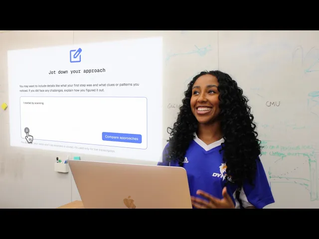
Layer 3: Reinforcement – AI-Powered Strategy Reflection
Will PicoCTF users spend 5 minutes documenting their solution approach for an AI learning summary?
Layer 4: Design System


AI Reflection smoke test: predicts 17% engagement from users (beat 15% target)
SUS (System Usability Score): 86

Our designs are shipping! Late 2025 as Phase 1 of 3-phase roadmap

Client Feedback


What Worked?
Early testing saved us from expensive mistakes. Assumption artifacts revealed that well-researched concepts can still fail—understanding what users do beats what they say.
"Wrong" paths led to breakthroughs. Testing with uninterested users felt like a dead-end at first, but it taught us that platform redesigns alone can't spark interest from scratch—we needed to focus on self-initiated learners —our real target audience.
Designer intuition + data > data alone. With 800,000+ users, perfect data is impossible. Conflicting feedback from different tests created decision paralysis until we used prioritization frameworks and trusted our design instincts to dig ourselves out.
What I'd Do Differently
Prioritize accessibility from day one. Timeline constraints pushed accessibility and responsiveness to the side—a trade-off I'd reverse given another chance.
Establish clearer success metrics upfront. While some metrics can only be validated post-launch, I'd create a clearer measurement framework earlier with pre- and post-launch validation plans
Aligning earlier with stakeholders about constraints to avoid deprioritizing features late in the process

My capstone team during our final presentation (left to right: Sanjna Subramanian, Zoe Mercado, Melissa Gibney, Hedy Hui, Megan Chai